For digital marketers, forms are a key part of an inbound strategy. But forms are not always as straightforward or effective as they could be. Although your website might boast clear calls to action and great landing pages, your forms may be limiting your conversion rate. Here are five simple ways you can optimize your forms for more conversions:
1) Move your form above the fold.
 Your visitor should not need to scroll down on the page to see the form. The longer a visitor has to spend looking around for the next step, the less likely it is they will complete the action.
2) Make it clear which form fields are required.
Some users are willing to give you lots of detailed information, but many want to fill out only what is required. Make sure your required fields are really “need-to-know” info, and make the rest of your fields optional. Clearly differentiate between the two. That way, you won’t lose conversions from users who are intimidated by the length of the form.
3) Use a call-to-action as the form’s headline.
Encourage visitors to complete your form by including a call-to-action as the form’s headline. This reassures the visitor that completing the form will result in their desired outcome. Here are some of intriguing headlines from Hubspot:
- Get Your Free [OFFER]
- Sign Up for [OFFER]
- Register for [WEBINAR/EVENT] now!
- Yes, I Want This [OFFER]
- Download the [OFFER]
- Claim Your [OFFER] now!
- Save Your Seat at [WEBINAR/EVENT]
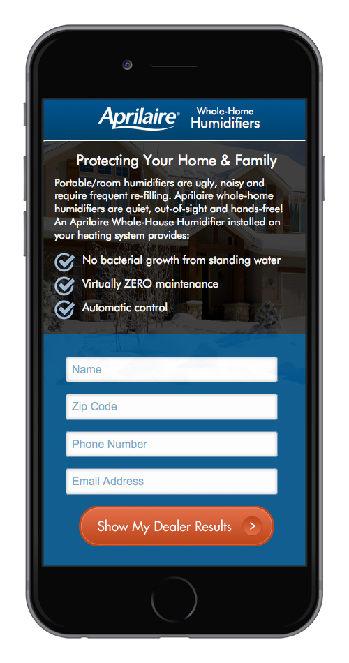
4) Make a Mobile-Specific Form
We know that mobile users interact with websites differently. If you ask mobile users to fill out the same form as desktop users, they may not complete it due to length, form fields, or style.
5) Use a call-to-action for your “submit” button.
Your submit button is your last chance to convince your visitors to fill out the fields on your form. To encourage them to complete the conversion, use a call-to-action that reaffirms how close they are to getting what they want. Here are some examples of more enticing button text from Hubspot:
- Download this ebook
- Sign me up for a demo
- Show me this presentation
- Claim your coupon
- Save your seat
BONUS TIP: A/B test parts of your form.
If you’re not sure exactly what the hang-up is with your forms, we recommend A/B testing to narrow it down. Perhaps the calls-to-action need to be stronger, or the wording needs to be tweaked, or maybe layout of the form itself is is the issue. No matter what the problem is, A/B testing can help you identify it before making a permanent change to a form. To learn more about A/B testing, check out our blog.
If you want to know how your website forms could be improved, contact Starkmedia.