The landscape of digital is vastly changing. Almost every digital experience can now be measured and analyzed through the data available to every organization. Analysts no longer have the time for answering ad hoc requests from internal departments. Marketers and analysts are not only expected to use dashboards to report on past performance anymore, but to identify future trends and provide solutions, empower sales teams with real-time information about the customers they may be interacting with, or provide executive leadership with key business information they need WHEN they need it.
 So how do we take dashboarding (the reporting of data) to the next level? Starkmedia continually optimizes our dashboard and reporting processes to give our clients access to the most comprehensive and usable data.
ESTABLISH A PURPOSE FOR YOUR DASHBOARD
Before even beginning to think about data, we often have to stop and think about the story we want to tell or the business question we want a specific dashboard to answer. Without having a story or purpose, your dashboards can be obsolete.
Here are the first two questions we always ask when creating a new dashboard for our clients.
1. What business question does my dashboard need to answer? (The more specific the better)
2. Are we collecting the right data to give a convincing conclusion? If not, what are we missing?
Once we have those questions answered, we use the following methods to create the most effective dashboards possible:
USE THE RIGHT VISUALIZATIONS
Part of telling a story with data is knowing how to present it. Knowing the needs of the company we are building the dashboard for greatly helps us in deciphering what visualizations to use within each dashboard.
We have also found the type of visualization you use can make a world of difference in telling a story. If the company can understand the main story of a graph at a glance, the visualization is just noise. We have found the following visualizations work well to deliver a specific message.
1. Emphasizing Trends – Line Chart
2. Comparing Items – Bar or Column Chart
3. Showing Relationships Between Items – Scatter Plot
4. Emphasizing Location – Heat Map
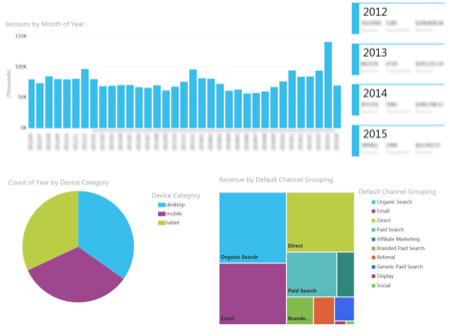
EMPOWER USERS TO INTERACT & SEGMENT IN REAL-TIME
The days of static dashboards are slowly coming to an end. Being able to provide interactive dashboards to our clients has made it easier for those companies to find answers and understand the value of data. The best way we have found to do this is to allow dashboard users to segment dashboards on the fly. We build interactive dashboards for our clients that not only allow them to see the overall performance of their website, but also segment the dashboard by time (year/month), mobile device, location, and even traffic source. This empowers our clients to find answers for themselves.
GATHER YOUR DATA IN ONE PLACE
Our clients have multiple data sets including web analytics data, CRM data, and customer support data. But most of these data sets have never been gathered together into one cohesive location. This means making relationships between these sets is next to impossible for them. Users are bombarded by far too many reports each month and the overall purpose of reporting is lost. The best way we have found to do this is through data visualization tools and platforms. They allow for just that; the combining of data for cohesive reporting.
Want to learn more about how Starkmedia can help your organization make sense of the data available at your organization? Let’s talk!