Many, if not most, of your visitors aren’t seeing your website on a desktop. They’re pulling it up on a phone, and that shift has exposed a major weakness in many homepages. What looks clean on a monitor can easily become cluttered, buried, or unclear on a smaller screen. And that confusion comes at a cost.
The Most Valuable Page on Your Site, Now the Most Overlooked
Your homepage sets the tone. It tells visitors who you are, what you offer, and where to go next. But too many mobile homepages fail to deliver that clarity.
Instead of a clear path forward, users are met with oversized banners, vague copy, and menus tucked behind hard-to-tap icons. Key content gets pushed down. Calls to action lose context. The result? Missed opportunities, especially when users are ready to take that next step.
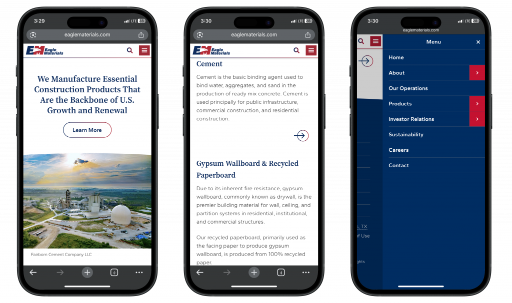
Shrinking Your Desktop Site Isn’t Mobile Design
Responsive design is a starting point, not a solution. Mobile users behave differently. They scroll faster, tap more quickly, and rely on simple visual cues. If your homepage doesn’t adjust for that behavior, performance suffers.
We see this constantly: headlines that scale down too far to be readable, CTAs hidden below fold, and navigation that’s more confusing than helpful. The page may be “responsive” in code, but not in experience.
Why It Matters
Your homepage is one of the most visited and most valuable pages on your site. But if the mobile experience is unclear, you’re likely losing people at the door. And when mobile makes up over 60% of traffic across most industries, those exits add up quickly.
It’s not just about user frustration. Mobile usability affects bounce rate, conversion rate, and even search rankings. Google continues to prioritize mobile-first indexing, which means your mobile homepage plays a bigger role in visibility than many realize.
What to Watch For
If your mobile homepage isn’t performing, some common culprits include:
- Important content buried under large hero images or banners
- CTAs placed too low, or lacking clear context
- Navigation hidden behind hamburger menus without clear labels
- Page load speed slowed by oversized files or scripts
- Layouts that stack poorly or create long, unstructured scrolls
Answer the Three Big Questions Fast
When someone lands on your mobile homepage, they’re looking for three things:
- What does this organization do?
- Is it relevant to me?
- What should I do next?
If your content doesn’t answer those questions clearly and early, you’ll lose the visitor before they reach your deeper pages.
Where We Come In
At Starkmedia, we work with clients to rethink the mobile experience, starting with content hierarchy, navigation, and homepage clarity. We surface mobile friction points, identify content bottlenecks, and recommend adjustments that make an immediate impact. These aren’t full rebuilds. They’re targeted changes that align design with how people actually use your site on the go.
Let’s Take a Look Together
If your homepage isn’t pulling its weight on mobile, we can help. Whether it’s a quick UX audit or a deeper look at content and structure, we’ll help you make it clear, fast, and effective on every device.
Get in touch to get started.